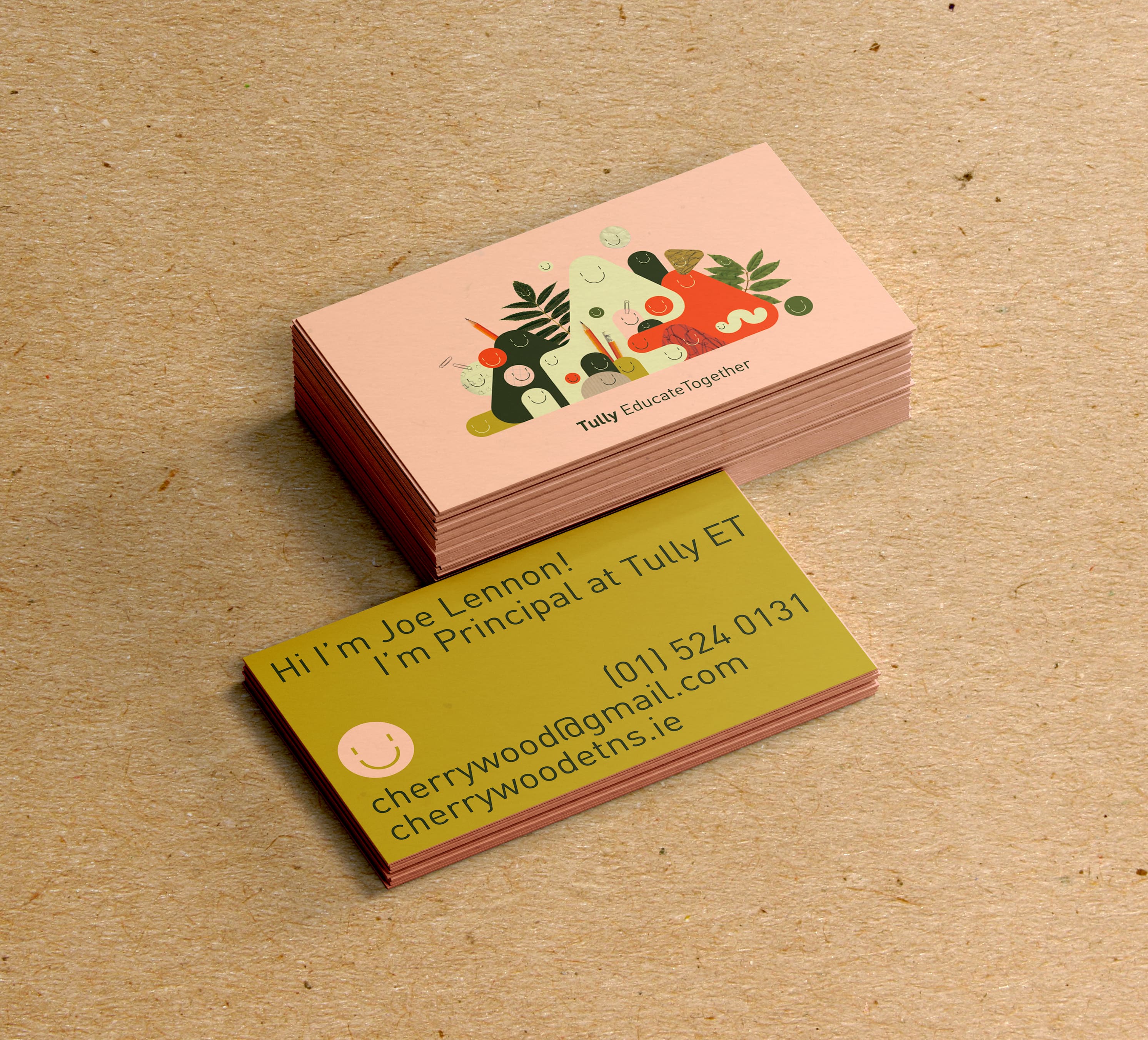
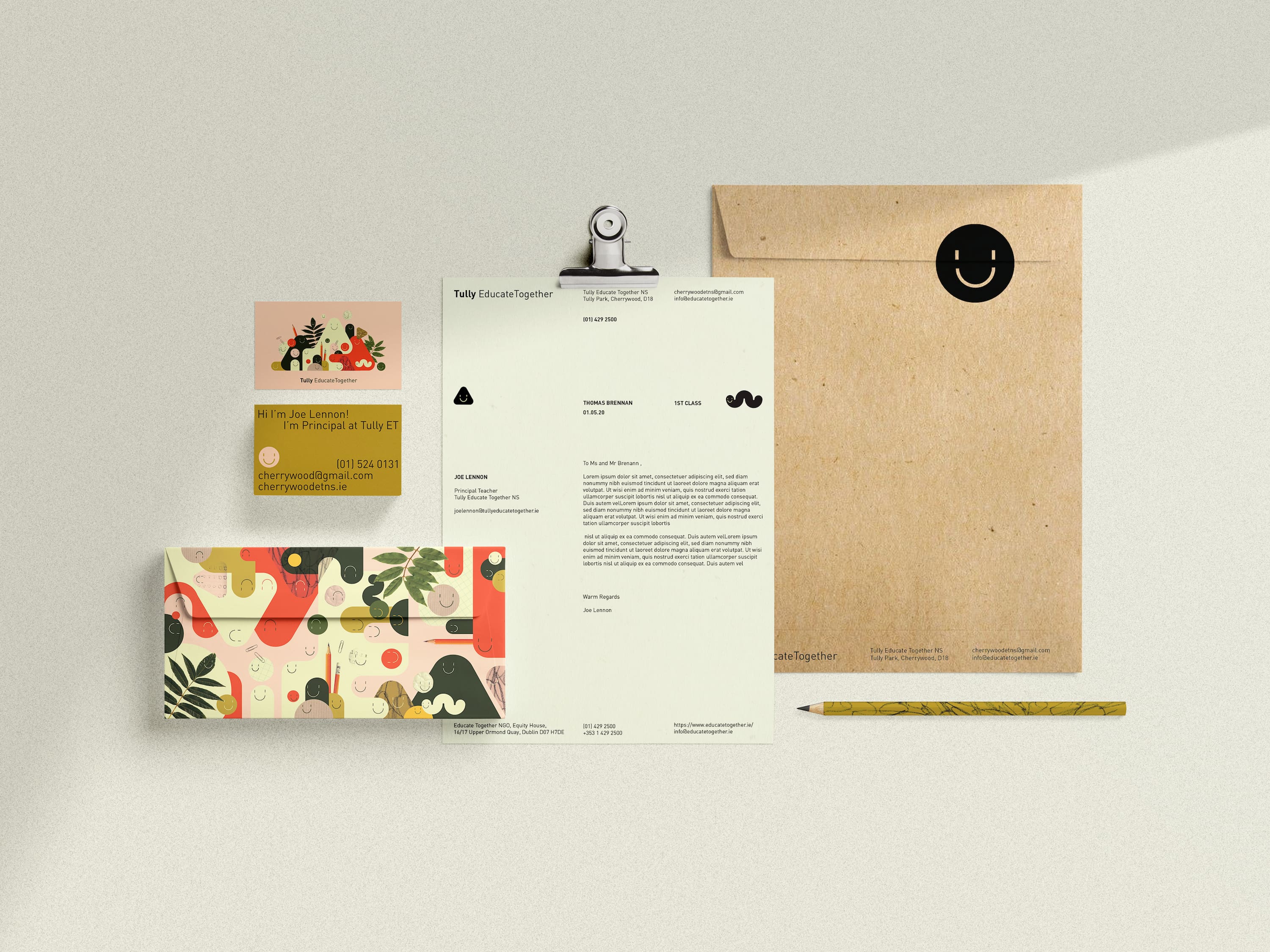
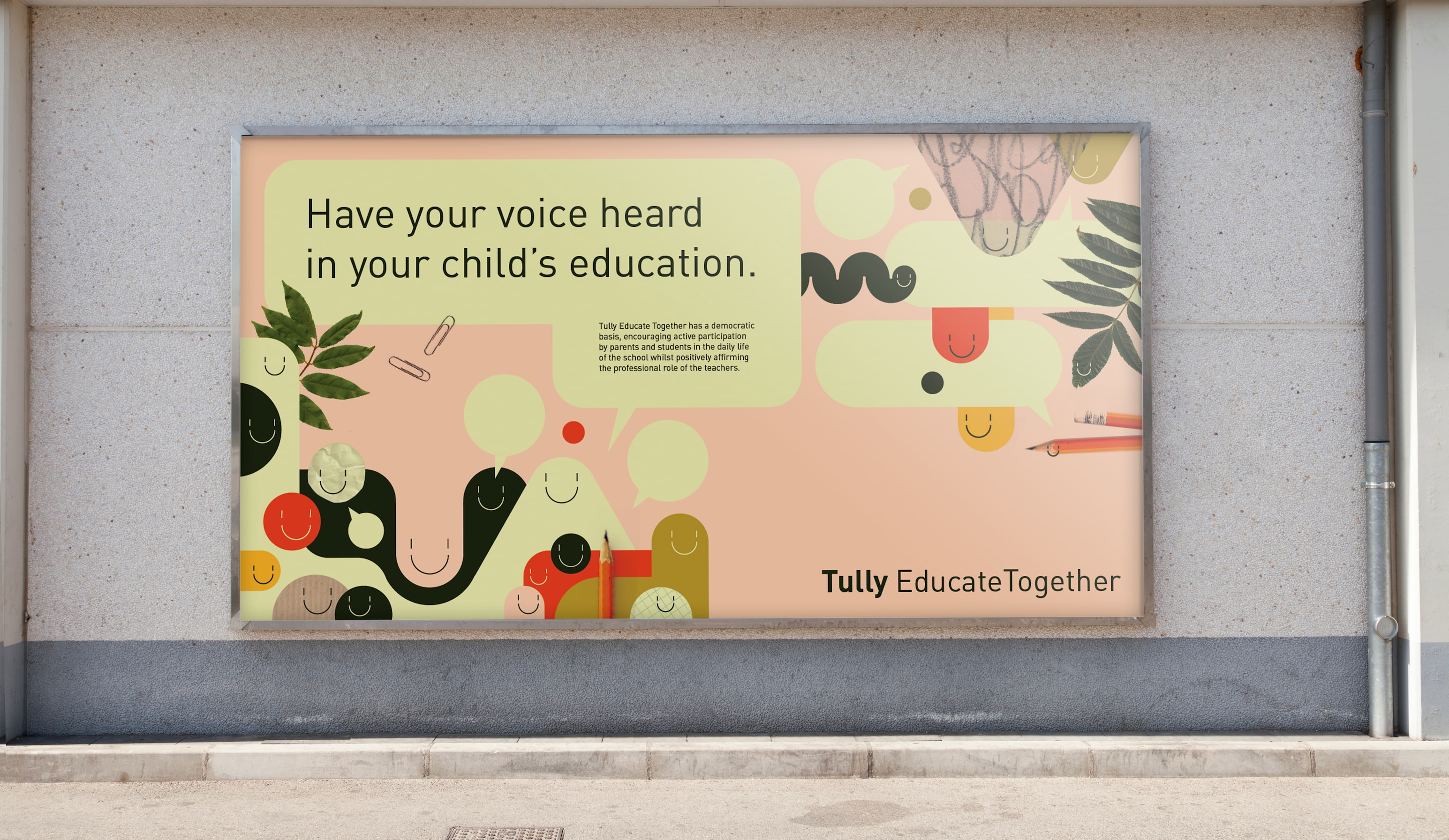
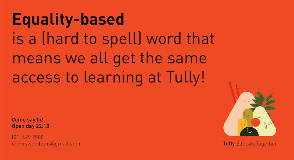
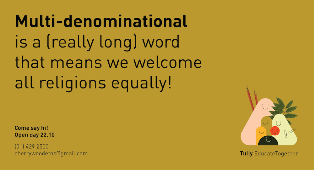
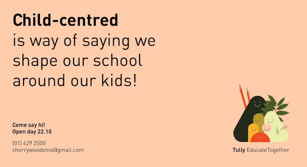
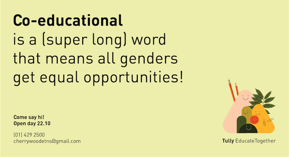
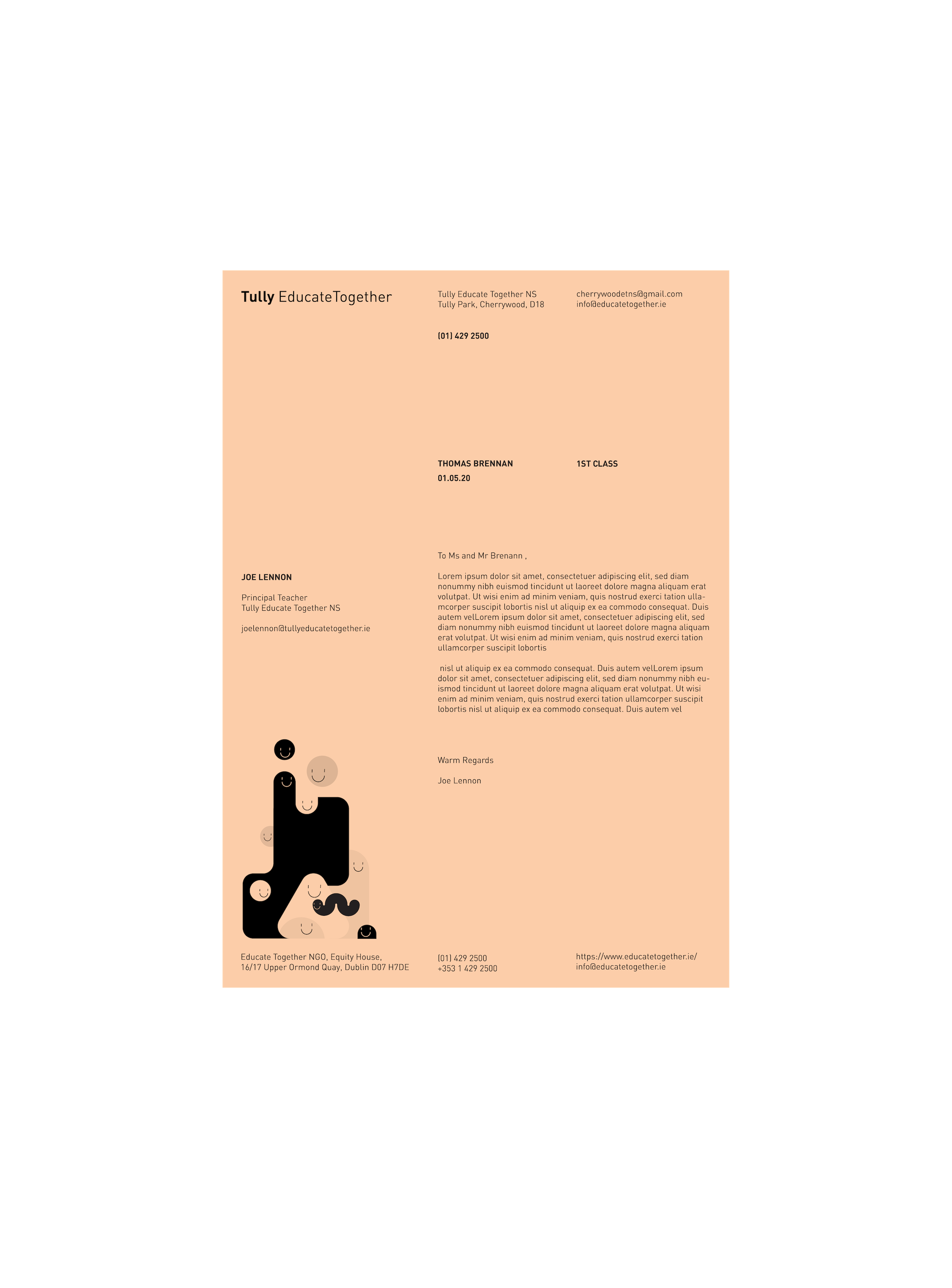
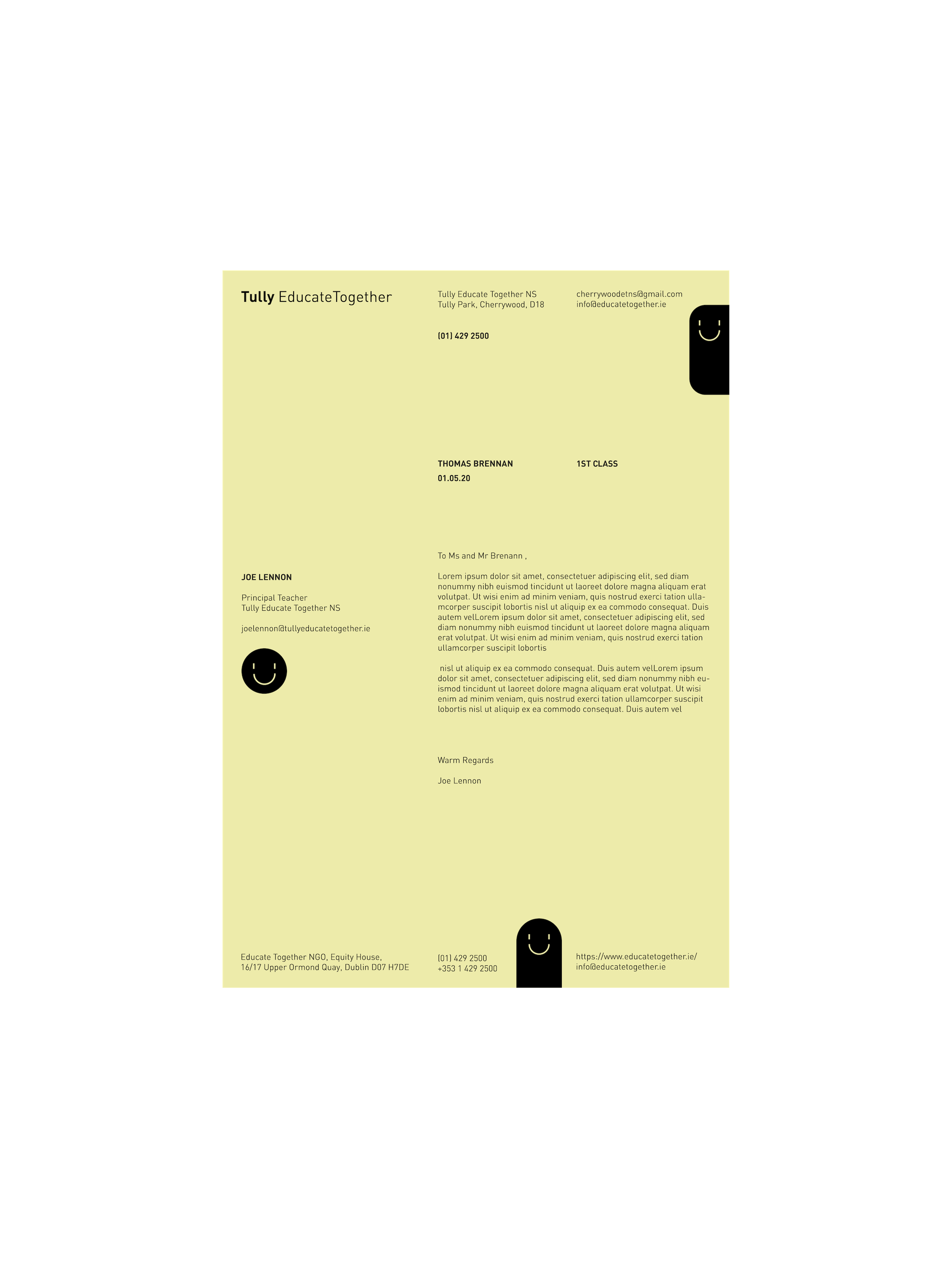
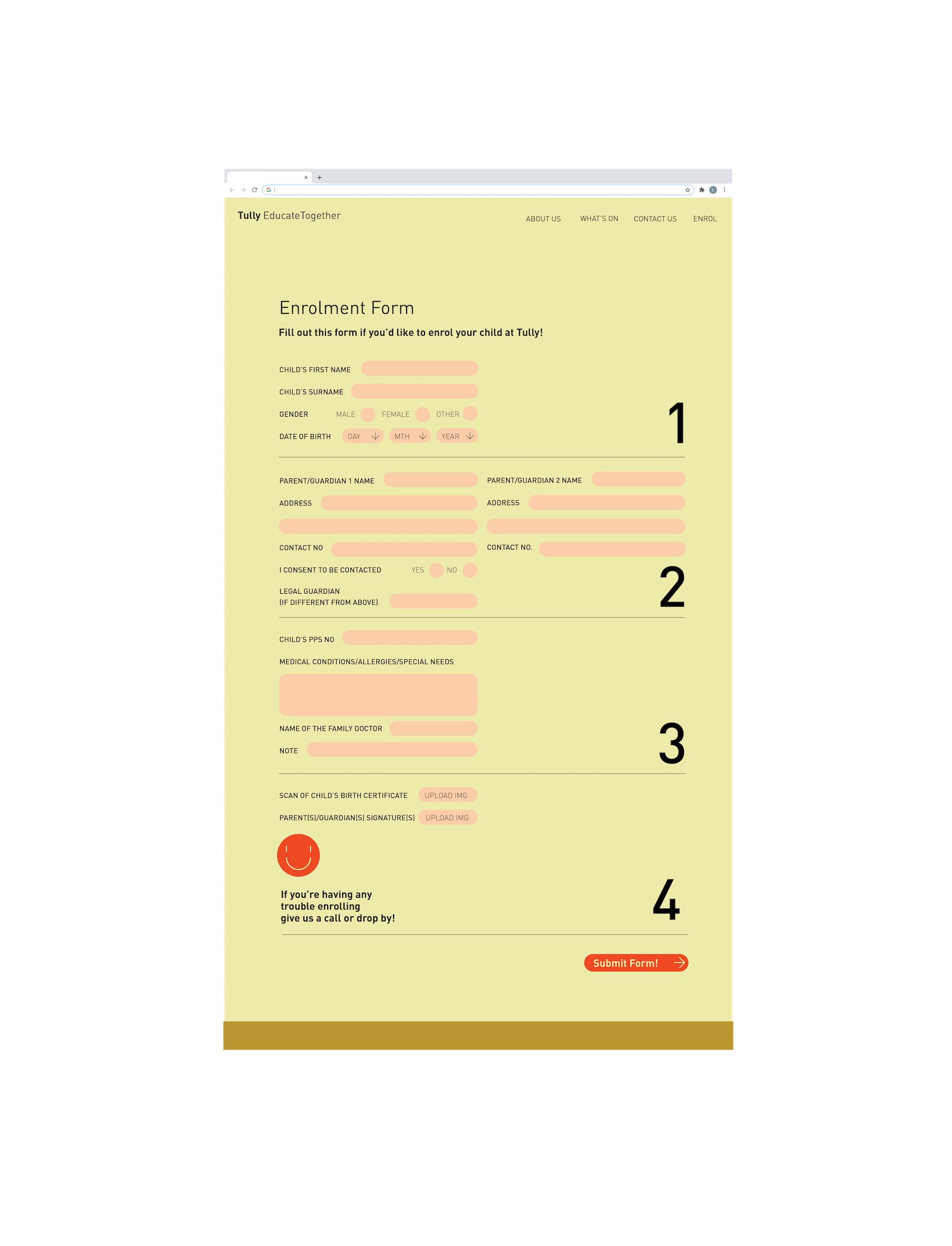
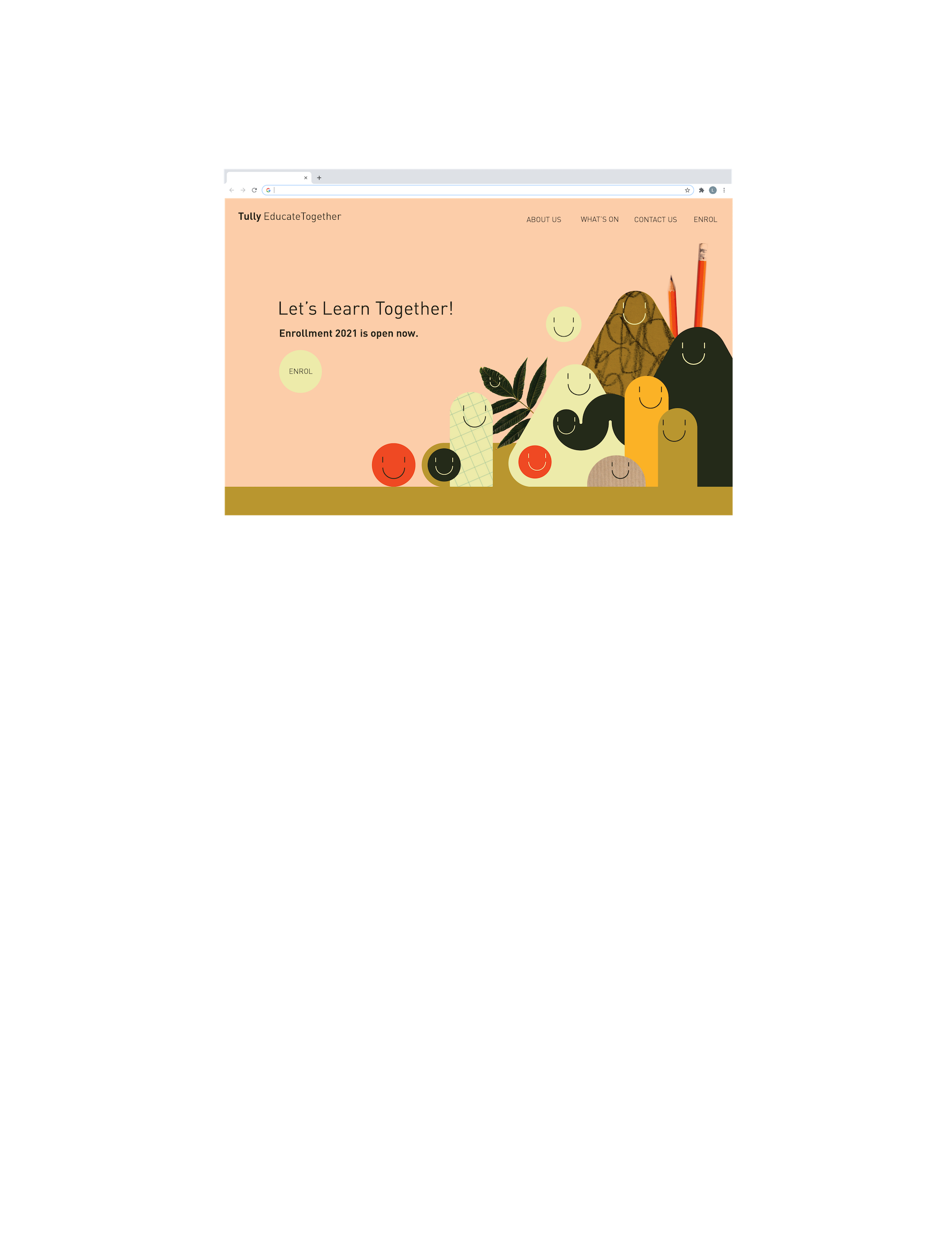
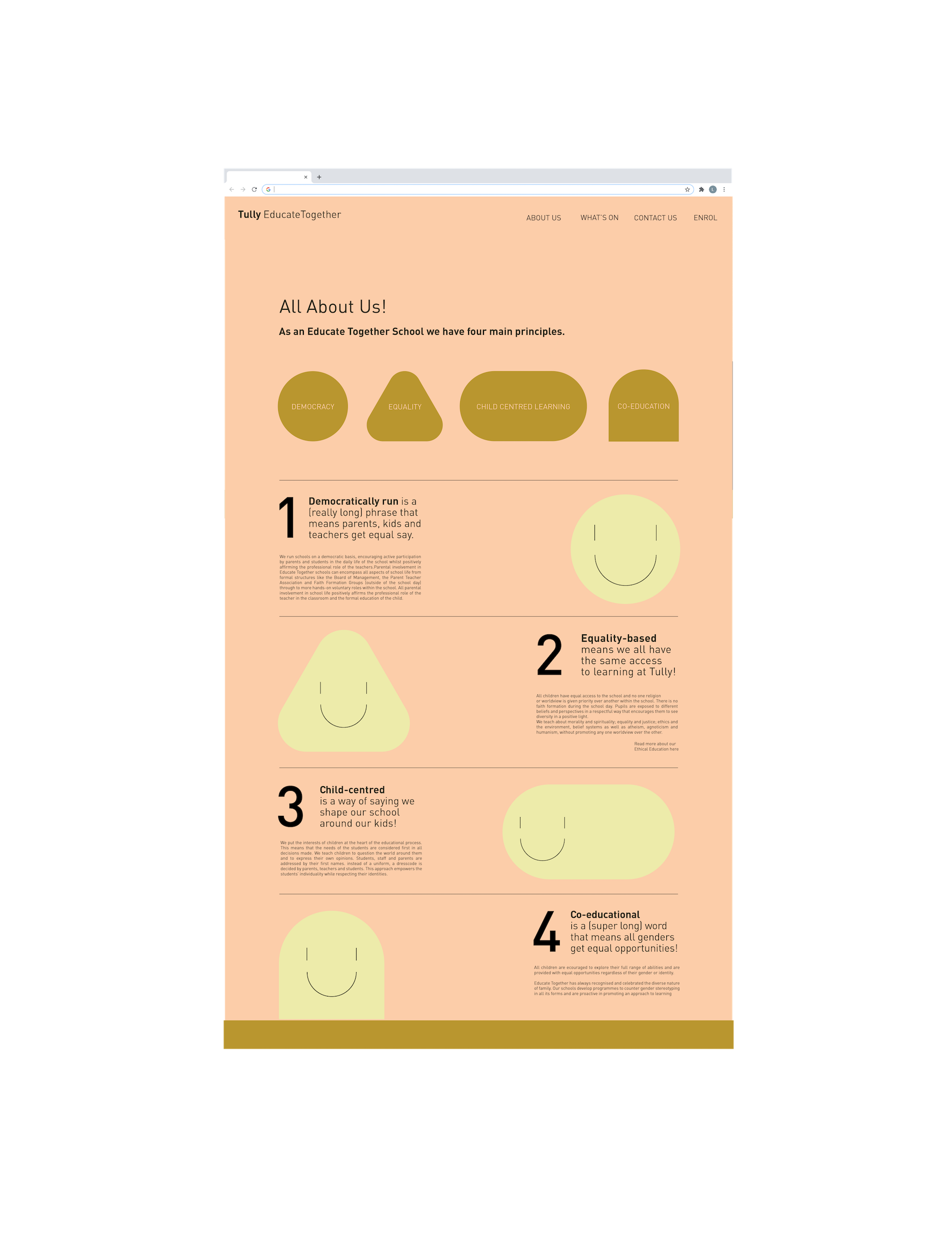
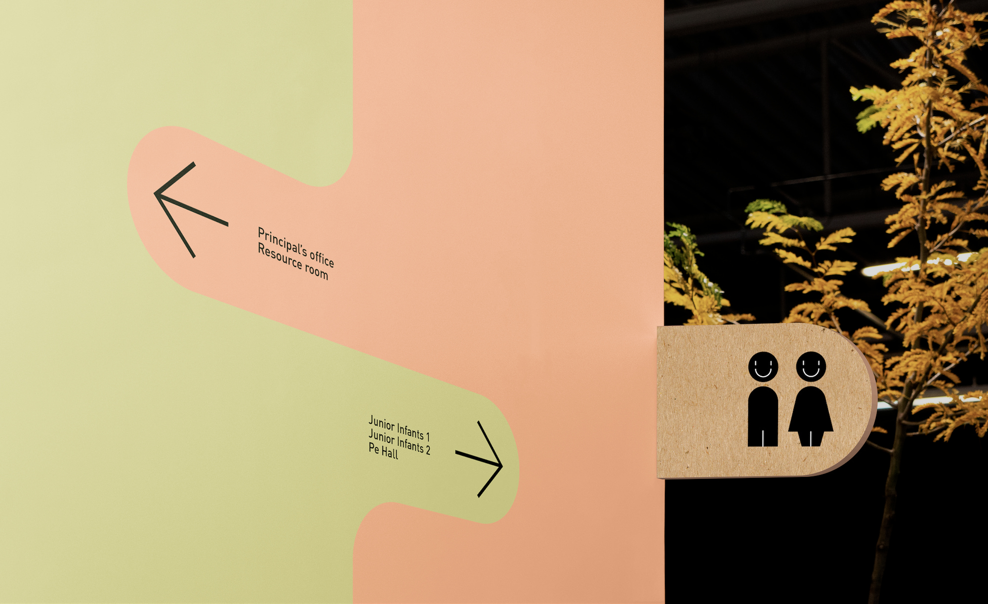
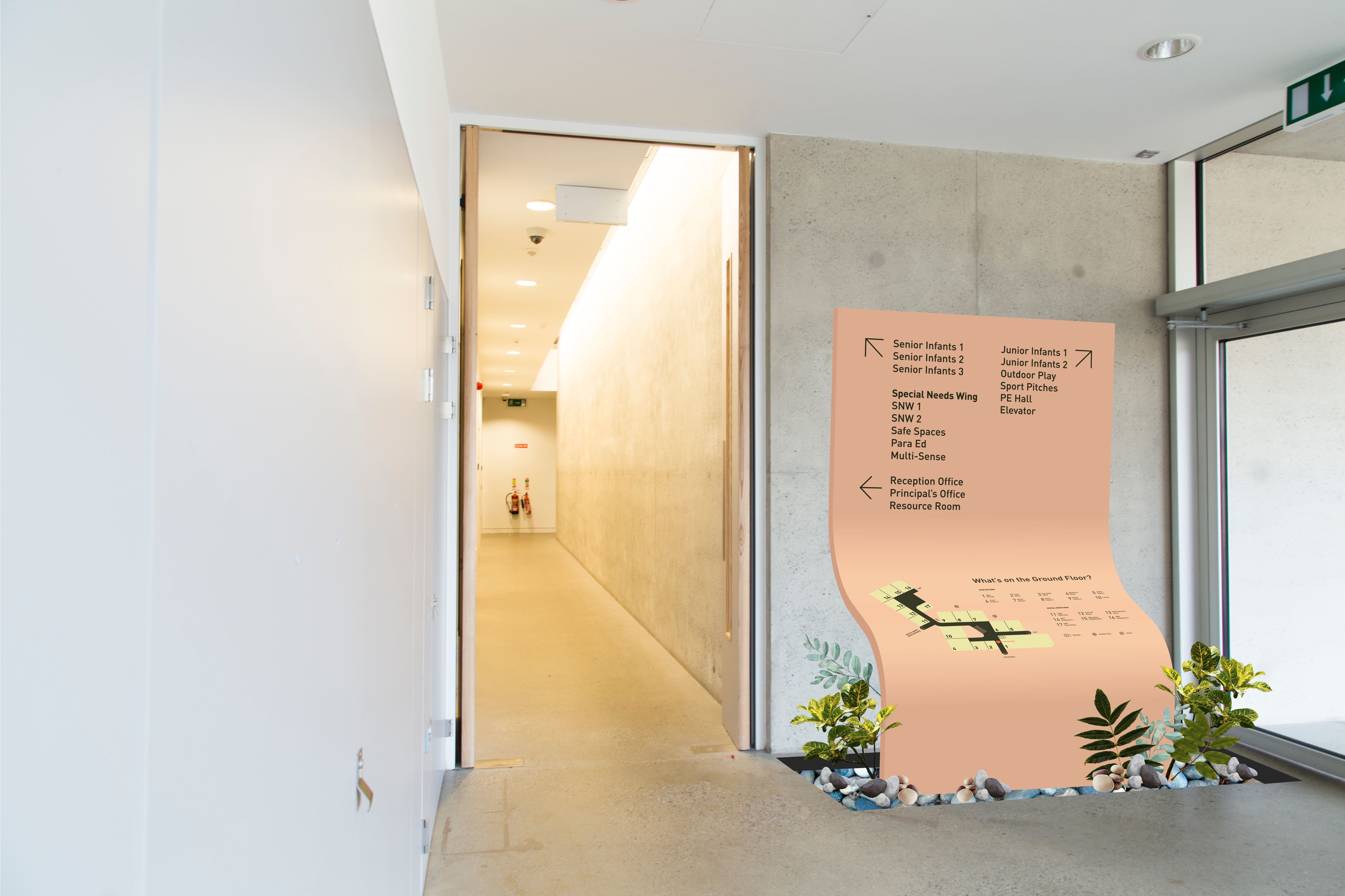
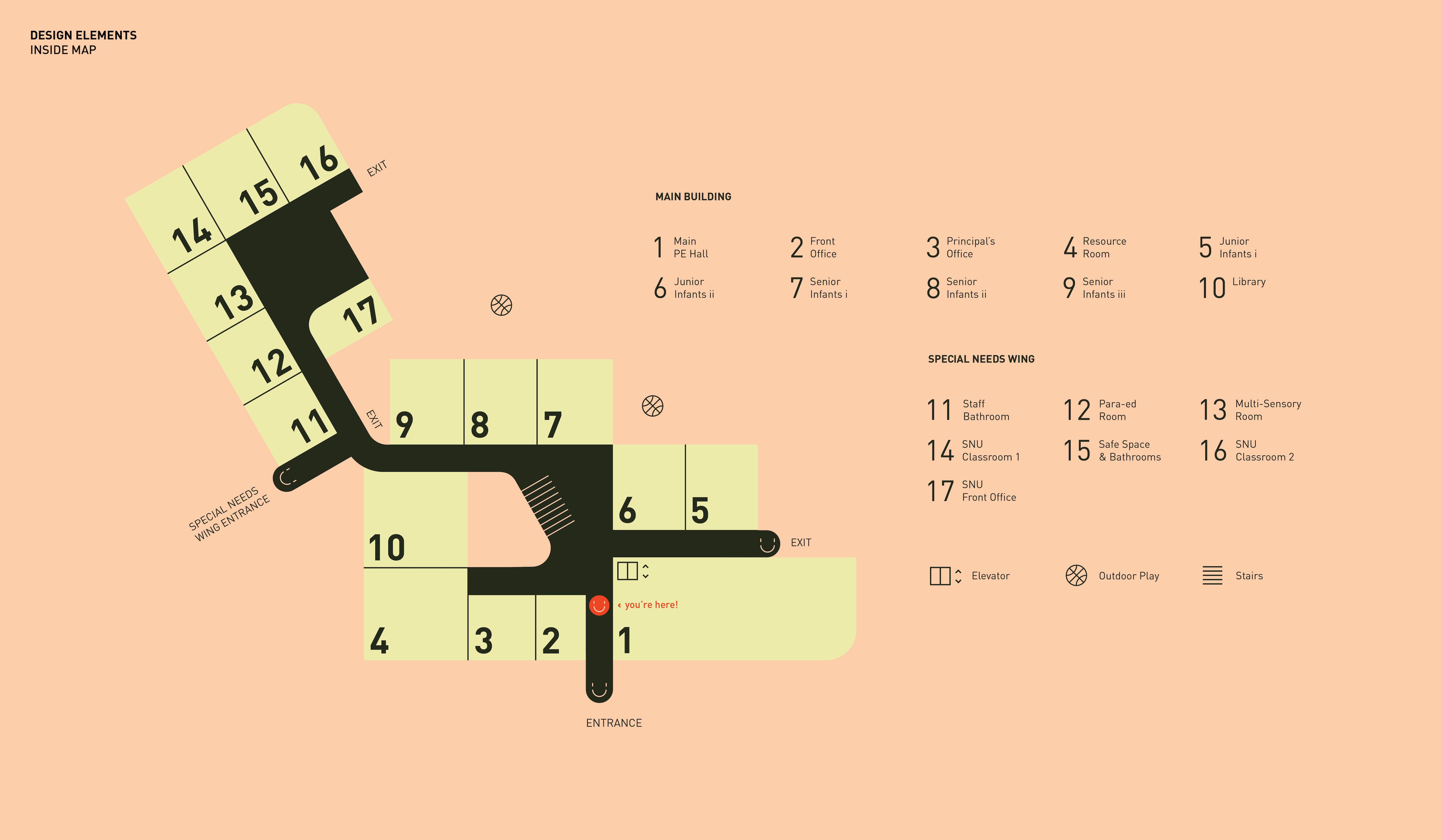
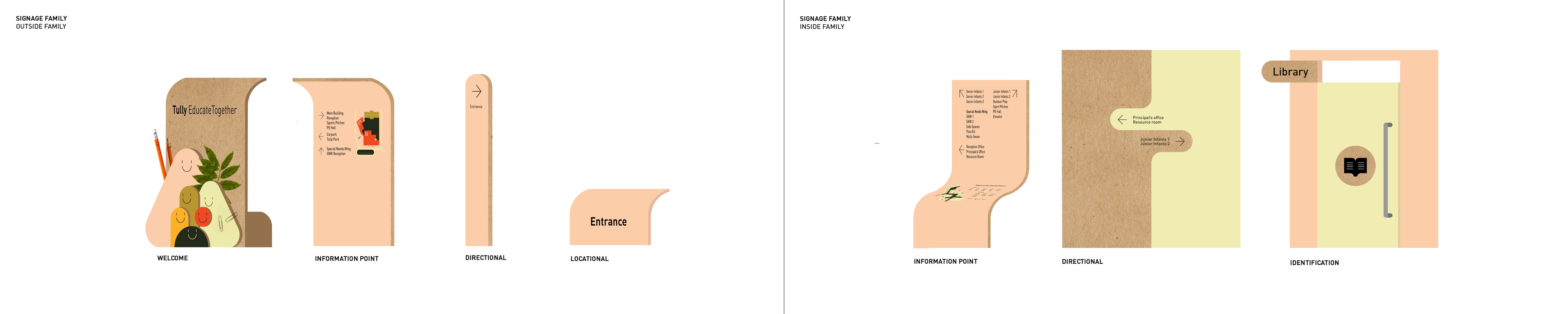
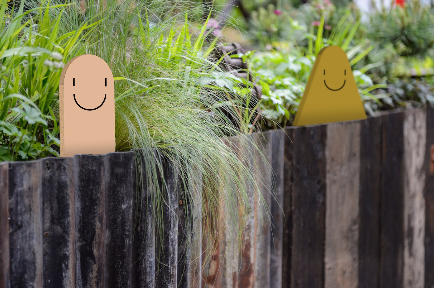
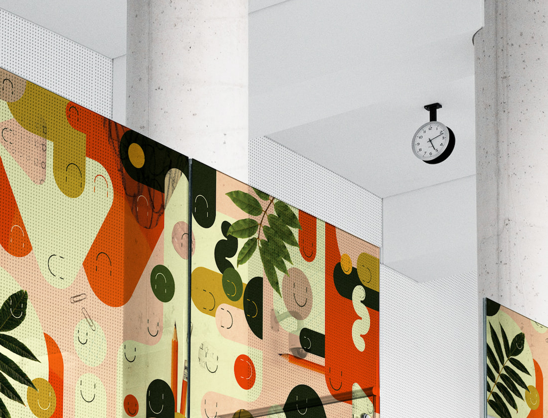
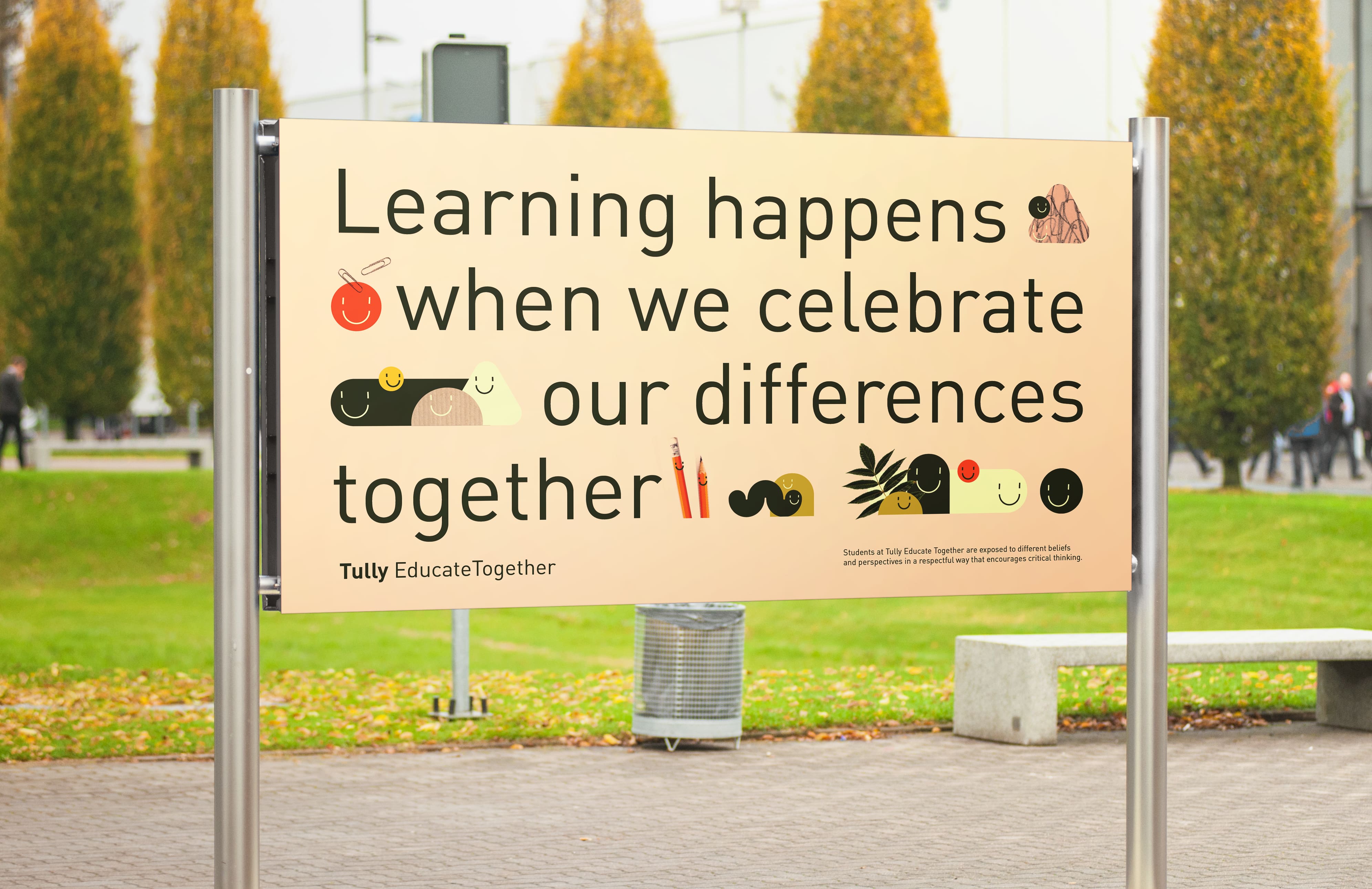
The identity is based around a family of fun, simple and diverse characters with photographic textures. The playful and accessible copywriting was a central element as one of the school's key selling points is that the children are given a voice in decisions at the school. I felt the design shouldn't be talking over the kids but rather something that directly engages and includes children at the school.